
Planning a watercolor, part 2: Using subpaintings
In this post, I’m sharing one of my favorite tools for solving problems and making choices when I’m planning a watercolor.
This tool may or may not be helpful for the painting you’re eager to get started on. There isn’t a step-by-step process for planning every watercolor. There are a lot of exceptions and special situations in watercolor planning. It could take a while before I get to the situation you’re most interested in.
But I also have quite a few articles and videos about planning already on my website. If today’s article doesn’t help with a painting you’re working on, have a look at the Planning Your Own Watercolors collection on my website (under the Learn tab).
Wait! I thought last time you said we don’t have to plan!
In the last article in this series, I told you I gave up doing thumbnails, value studies and color studies. Some people took that to mean I was saying we don’t need to plan our paintings at all. That’s not exactly what I meant.
“Planning” is just making choices about how to do something. You can’t start a painting without making some choices, but you don’t have to make all of them before you begin. For watercolor, it might not even be a good idea to try to plan too much before you begin.
Most of us are drawn to watercolor for its quirky unpredictability. If you want to leave room for “happy accidents”, you need a planning process that allows space for them to happen, plus ways to adapt your plan to take advantage of them. In today’s post, we’re solving a problem before beginning our painting, but we could also use the same strategy to solve a problem that crops up with a painting in progress.
Don’t think of my examples as templates for how you should plan. Think of them as case studies illustrating one way to use a particular strategy. Adapt and change the ideas to suit yourself. There is no one right way to plan watercolors.
Also, in this example, I’m imagining we’re painting a watercolor that will follow our reference photo fairly closely. That’s not because I’m recommending sticking close to a reference photo. I’m starting with this example because it’s a process that’s familiar to most of you, even if it’s not how you work now.
(I’m also not telling you not to closely follow a reference photo. I find that too confining, but if you enjoy working that way, do what works for you. However, if you are sticking close to your photo because you think you’re “not ready” to plan your own paintings, I hope to convince you that even beginners can begin planning paintings. I think it’s best to begin learning planning skills alongside painting skills. (Besides, you can make a lot of paintings much easier, and every bit as lovely, by freeing yourself from sticking too close to the photo.))
If you’re normally a more intuitive painter (or want to be), hang in there. In the next article, we’ll begin talking about how you might begin making changes to the photo, and in later articles we’ll talk about starting from multiple references, or none at all.
Enough preliminaries, let’s go paint!
Using sub-paintings to solve problems and make creative decisions
What problem/decision/choice are we working on?
At the end of the last article in this series, I asked you to think about what problems you’d need to solve before you’d feel ready to start working on a painting based on this photo.

It would have been better to ask “What choices would you need to make before you’d be ready to begin painting?” I should have phrased it that way because even if you don’t see any problems to solve, you still usually need to make at least some choices before you begin.
If you want to work in parallel with me on a painting of your own, take a moment now to look at your references and ask “What choices do I need to make (or what problems do I need to solve) before I’m ready to begin working on this painting?”
Today’s challenge: How will we suggest the reflections?
Several of you identified the reflections in the water as a challenge, so for the purposes of today’s example, let’s say we’re working on “How do I want to suggest the reflections in the water?” Let’s see how to use subpaintings to help us experiment with techniques for handling the reflections.
What do I mean by a “subpainting”?
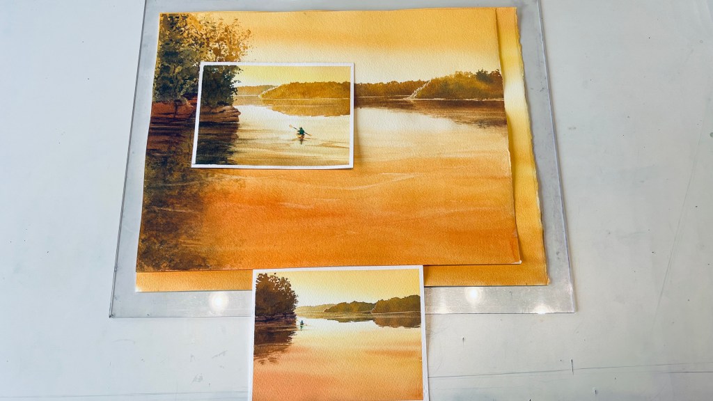
Many of the usual planning studies—thumbnail drawings, value studies, color studies, compositional studies, field studies—are miniature versions of the entire painting. Maybe with less detail, but it’s still the entire scene, shrunken down. I call these smaller versions of the whole scene mini paintings.
Mini painting = a smaller version of the entire painting (maybe with less detail)

Mini paintings are fine for figuring out composition or choosing a color scheme, but they’re often not a good tool for figuring out what techniques you want to use in watercolor.
Scale matters for many watercolor techniques. In many watercolor techniques, we rely on water to help move the paint. But how far the paint moves depends on how wet the paper is and how much water is in the brush, not on the size of the piece of paper we’re painting on. For example, you might be able to easily complete the entire sky of a postcard by misting the paper and dragging a brush on its side to create ragged clouds, but you’d have trouble using the same technique for the sky on a large painting. Even if you used a bigger brush, the paper would probably start to dry before you finished the whole sky.

For choosing which techniques you want to use in watercolor, it often work on a partial scene—a small section cropped out of the larger painting—instead of a shrunken version. This is what I mean by a subpainting.
subpainting = small excerpt of the bigger painting (think “CROP, DON’T SHRINK”)
Some other advantages of subpaintings
One difficulty at a time
In subpaintings, we can leave out or ignore anything not involved in solving the specific problem at hand.
For example, I’m going to leave out that dead snag sticking out in front of the trees. I also don’t need any color in the sky to figure out how to paint the reflections. So I can skip laying down a sky wash. This makes it faster to do a bunch of subpaintings of reflections without having to wait for sky washes to dry.
I want to work wet-in-wet inside the reflections, but it might be hard to pay attention to dropping in colors in the right places while also figuring out how to do the rippled edge where the tree reflection meets the sky reflection. So I chose to start with a subpainting where the dark reflection of the trees runs all the way to the bottom of the page. I’ll tackle the rippled edge later.
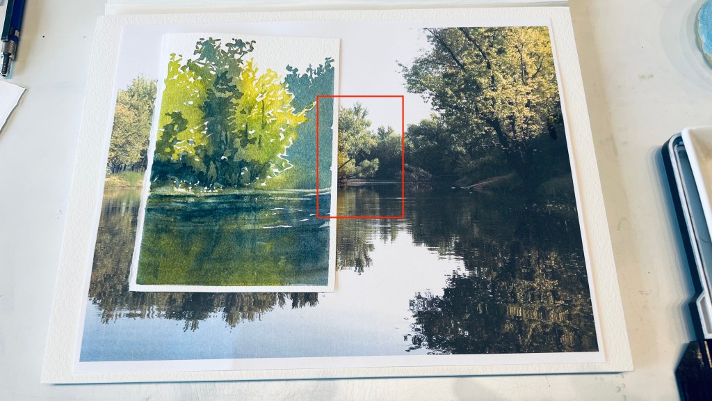
I do need to include some trees so there’s something to reflect. But what if trees are also a challenge for me, or I want to explore different ways of handling them? In that case, I could start with some subpaintings of just trees, then move on to reflections later. One difficulty at a time!

Instant easy designs for beginners or for short painting sessions
Tossing out everything that’s giving you trouble is a great way to come up with a postcard or small painting that even a beginner can tackle. (It’s also helpful when you’re sketching on location, or when you only have a little time to paint.)
If you don’t give yourself too many problems to tackle at the same time, you’re less likely to overwork. A simple painting with fresh, luminous washes looks more accomplished than a busier painting with overworked areas. A little tree painting like this makes a great postcard or a little pop of color and interest on a bookshelf or in a grouping of small paintings. You don’t have to have a “background” or add everything you can see in a scene to make a nice little painting.
Practice that results in finished paintings
I use subpaintings as stepping stones to build the skills I need to paint a more complex painting, while at the same time getting some nice little finished paintings out of my practice.


If I just practice a new technique a few times on a piece of scrap paper and then jump straight into using it on a larger painting, I’m likely to wreck a painting I’ve put a lot of work into. Subpaintings give me a good chance of having something to show for the time and effort I put into practicing. That helps me practice with care and focus (but no anxiety).
Subpaintings build the habit of thinking about how you might simplify
Sometimes we include unnecessary stuff in our paintings just because we didn’t think to ask whether we really needed it. Or, we worry that if we don’t add more detail to something, the viewer won’t know what they’re looking at.
Subpaintings are a great way to experiment with just how much you can leave to the viewer’s imagination. If you misjudge and leave too much to the imagination on a postcard, it’s no big deal. You can give the viewer some additional cues with what you write on the back: Colors and shapes from a morning on the river, or playing around with wacky trees.
Subpaintings free you to experiment and find your style
They’re small, fast and low-stakes, so it’s a lot easier to try something new or wacky and see if you like it.

There are a lot of other uses for subpaintings, but it’s time to move on. We still have to decide how we’re going to suggest those reflections.
Using subpaintings to help solve our problem
Okay, so we’ve identified a challenge, and chosen what to include in a subpainting to help us solve it. Now what?
If the challenge is how to use watercolor to suggest something, what many people do is to start by searching for “how to paint [whatever]” in books and online. Then you can use your subpaintings to try out the various ideas and choose between them. (And save the ones you like to build your own file of handy watercolor tricks!)
Sometimes you like the look of a technique in the painting where it’s demonstrated, but when you try it yourself you find
- it’s too difficult to pull off
- it’s too tedious—or too slap-dash—for your tastes
- it doesn’t fit together well with other techniques you plan to use
Subpaintings help us gather information about what’s involved using the technique, instead of just what it looks like in someone else’s painting.
Okay, but what if you can’t find a ready-made solution that you like?
How to figure out your own watercolor techniques
What are the visual cues
Asking “How can I paint [something] in watercolor?” is basically the same as asking “How do I give a viewer the right kinds of visual cues to figure out that these colored marks represent [that thing]?”
Luckily, your viewers’ brains use the same visual cues your brain uses. So, you can just ask yourself “What visual cues is my brain using to tell me that this is a reflection in water?” In other words, “How do I know this is a reflection in water and not something else?”
Some of the things that I notice about the reflections:
- the colors and shapes inside the mass of trees on the shore are mirrored with similar colors and shapes inside the reflection on the water
- except, they’re a little blurrier and a little darker
- the edges of the reflection are broken up in a pattern of horizontal lines (that get skinnier as they get farther away)
- the reflection seems to be stretched vertically; it comes a little farther down from the shoreline than a true mirror image would
- there are a few horizontal lighter streaks through the dark parts of the reflection
It’s okay if we miss some features. Our subpaintings are going to allow us to test whether we’ve really identified enough cues for our viewers.
Next we need to figure out how to give those cues.
How can I give those cues using watercolor?
I’m leaving aside the problem of the rippled edge for now, and for these first few subpaintings, I can probably also ignore the slight vertical stretching. What about the other cues?
To mirror the colors and shapes from the trees, I might need some planning marks to keep everything lined up, but since the reflection is blurry it doesn’t need to be a perfect mirror image. The reflection is dark enough that I could put in some planning marks to help guide me, perhaps some lines where I want to place the main visible trunks in the trees and in their reflections. So that part doesn’t seem too hard.

Making the colors a bit darker is also not a big problem. I’m not sure how much darker, but that’s something I can experiment with in my subpaintings.
Making the shape blurrier seems like a perfect place to paint wet-into-wet within the overall shape of the reflection. Is that controllable enough? How wet should the paper be so that I get the amount of blurriness I want? More things to test in my sub-paintings.
So, let’s mix up some color for our trees, make some puddles with somewhat darker versions, make a few planning marks to help us line up the reflection with the trees, and give it a try!
I’m also wondering if the amount of blurriness in the reflection needs to be different depending on how I decide to handle the trees. So I made a bunch of sub-paintings where I varied how I handled the trees, and tried wetting the paper for the reflection different amount, to see what gives me the amount of blurriness I like.

I discovered that as long as I kept the colors and shapes in the reflection at least approximately lined up with the colors and shapes in the mass of trees above them, that seemed to do most of the work of telling me it was a reflection. I liked some of the reflections better than others, stylistically, but they all said “reflection” well enough that a viewer would know what they’re looking at.
Along the way, I also discovered I could suggest the subtle horizontal pattern of light and dark bands or streaks inside the reflection either by gently lifting a little color with a swipe of a damp brush, or by glazing over a little bit of a darker color. Either method seems to give the right kind of cues.
But wait! I see more things to figure out!
We still need to figure out how to manage that wet-in-wet effect over a larger area, and at the same time, add that rippled edge. You may have also noticed other choices you’d want to make or problems you want to solve. You might see other subpaintings you’d want to do if you were going to create a painting based on this photo. But subpaintings, by themselves, won’t solve every problem we face in planning a watercolor. We need more than one planning tool in our toolkit. But, whew! we’ve covered a lot in this post! Time to get your brush wet and try some subpaintings of your own.
Feel free to use the example photo to practice subpaintings, but it would be even better to try out this strategy with your own photos and subjects.
If you’re a beginner, or you only paint small paintings, see if you can find some manageable sub-paintings inside a scene that you would like to paint larger someday. Remember, try to get each subpainting down to just one new challenge! You don’t need a “background” and you can toss out anything that adds complications.
If you get down to just “one thing” and it still feels too challenging, zoom way in, and try just part of the “thing” you’re painting. If you zoom in so close that it turns into just an abstract design with pleasing colors, that’s fine! See if you can get the blush of color on a cheek or the frilly edge of the flower. Or try just the silhouette of something with no 3D form or interior detail.
(If you feel like you need a bit more guidance, you can look over my shoulder while I work on a few subpaintings in the next post.)